Key Takeaways
- HQD launches a comprehensive brand identity refresh, introducing brighter visuals, an updated slogan, and a redesigned brand symbol.
- The renewal reflects HQD’s evolving personality: vibrant, open, and gently healing—aligned with modern consumer expectations.
- The brand reaffirms its core philosophy of Humanity, Quest, and Devotion while expanding meaning through values such as vitality, harmony, and quality.
- HQD unveils a redesigned official website and shares its global footprint: 120+ countries, 18,000+ retail stores, and over 20 million users.
- The refresh supports HQD’s long-term mission to deliver personalized, human-centric vape products and an emotionally supportive brand experience.
A New Chapter for HQD
Global vape brand HQD has officially launched a renewed brand identity, marking a major milestone in its more than decade-long growth. Since 2014, HQD has positioned itself as a technology-led, human-centric company built on three foundational values—Humanity, Quest, and Devotion. Over the years, it has expanded into more than 120 countries, partnered with 18,000+ retail outlets, and grown a community of over 20 million users worldwide.
Facing a rapidly evolving vaping landscape and rising demand for brands that offer emotional resonance—not only products—HQD is reshaping how it presents itself to global audiences.
A Fresher HQD: Vibrant, Open, Gently Healing
HQD’s renewed identity speaks to a market where consumers seek both premium quality and emotional well-being. The new brand direction reflects HQD’s commitment to becoming more vibrant, more open, and more attuned to moments of clarity, relaxation, and gentle healing.
Beyond Humanity, Quest, and Devotion, the brand expands its meaning into a range of values such as Harmony, Heartfelt, Hopeful, Dynamic, Delightful, Quietude, and Quintessential—showcasing the emotional richness HQD hopes to bring to modern lifestyles.
Brighter Visual Identity
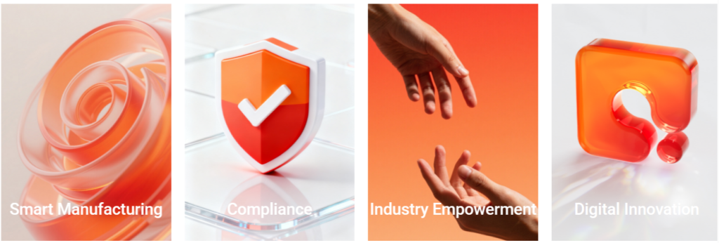
At the center of the refresh is a vivid new visual identity. HQD’s signature orange has evolved into Brighter Orange, symbolizing vitality, curiosity, and confidence. The refreshed palette communicates HQD’s belief that every puff should feel uplifting and fresh. A series of revamped branded merchandise accompanies the visual update, bringing the new color system into everyday use.
A Slogan Built for the Present
The new slogan—“Let’s Fresh the Moment”—captures HQD’s aspiration to celebrate presence, vitality, discovery, and the simple joy of now. It serves as both an invitation and a philosophy, encouraging users to pause and experience small moments of renewal.

A Refined Brand Symbol
HQD’s redesigned “Q” symbol embodies the brand’s balance between emotion and technology. The new icon integrates airflow elements and vapor particles into a dynamic form. Rounded shapes represent warmth and openness, while squared accents signal precision and purpose. The symbol reflects HQD’s identity as both a creative and rational brand continually evolving through design and innovation.
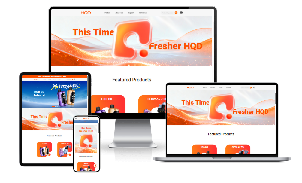
A New Website Experience
The brand refresh extends to HQD’s newly launched website. The redesigned platform features a cleaner layout, Brighter Orange color system, smoother navigation, and more intuitive interaction patterns. The result is an engaging, energetic digital experience aligned with the brand’s updated personality.
Official Website: https://hqdtech.com/
Looking Ahead: Innovation with Warmth
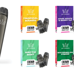
HQD continues building its product family—including the CUVIE, GLOW, and GO series—while developing new lines that combine aesthetics, reliability, and personal expression. As a tech brand rooted in human-centered design, HQD aims to offer not only quality vaping solutions but also emotional comfort in an increasingly fast-paced world.
Whether through better technology, refined visuals, or comforting brand values, HQD invites global users to embrace clarity, creativity, and gentle healing.
With HQD, the moment stays fresh.
Latest in Business


Advertisement
Advertisement
Advertisement